
* 2012-01-30, Earth, Picture taken by Visible/Infrared Imager Radiometer Suite (VIIRS), NASA. *
Content
- 1) Types of data used
- 1.1) Water usage
- 1.2) Temperature levels in Montreal
- 1.3) Global CO2 levels
- 1.4) Global methane levels
- 1.5) Global temperature
- 1.6) Arctic ice minimum extent levels
- 1.7) Ocean temperature levels
- 1.8) Global population
1. Types of data used
To deepen our understanding of our planet, it is important to gather and analyze data, draw insightful interpretations, and formulate conclusions based on it. Within the scope of this project, sits righteously one of our primary focuses which is the examination of daily water consumption. This investigation seeks to shed light on the magnitude of our reliance on water resources and emphasizes the importance of conscious usage.
Secondly, we turn our attention to the examination of the open-sourced Global Climate Change data generously provided by NASA and NOAA. These datasets encompass critical indicators such as Global Carbon Dioxide emissions, global temperature variations, Methane levels, Arctic sea ice minimum extent, ice sheet dynamics, sea level fluctuations, and ocean warming temperatures. Each facet of this dataset contributes valuable insights, affording us the opportunity to analyze and, potentially, forecast the future that awaits us, should we choose negligence. Thus, highlighting the urgency of taking actions to address the challenges posed by these environmental dynamics.
1.1 Water usage
Through half of August to November, we have collected data from Vanier College’s Elkay EzH2O [1] water dispenser. The following data shows how much bottles of water have been filled each day as well as the time the record was taken at. The rest of this data can be accessed Here
1.2 Temperature levels in Montreal
The following data was retrieved from the “Daily Data Report” provided by the Government of Canada. This data provides us with maximum and minimum temperatures, precipitation, total snow, wind speed, etc. The rest of this data can be accessed Here
1.3 Global CO2 Levels
The following data was retrieved from the “global climate change, vital signs of the planet” [2] extensive collection of climate studies provided by NASA. However, this data is provided by NOAA [3] under the GML (Global Monitoring Laboratory) research branch. It encompasses monthly mean CO2 levels since 1958. The rest of this data can be accessed Here
1.4 Global Methane Levels
This data was also provided by NOAA under the GML (Global Monitoring Laboratory) research branch. It was retrieved from NASA’s “global climate change, vital signs of the planet” website. This data provides us with methane concentrations since 1984. The rest of this data can be accessed Here
1.5 Global Temperature
The following data was also provided by NOAA’s extensive collection on Climate Change. This data provides us with a yearly-average global surface temperature since 1880. The rest of this data can be accessed Here
1.6 Arctic ice minimum extent levels
The following data was also retrieved from the “global climate change, vital signs of the planet” climate studies provided by NASA. However, this data was collected by the National Snow & Ice Data Center ‘NSIDC’. It contains yearly arctic ice extent in square kilometres since the year 1979. The rest of this data can be accessed Here
1.7 Ocean temperature levels
The following data was also retrieved from the “global climate change, vital signs of the planet” climate studies provided by NASA and NOAA. It contains yearly data such as the Change in World Ocean Heat Content in Zettajoules, Northern OHC, Southern OHC, etc. The rest of this data can be accessed Here
1.8 Global population
The following data was retrieved from ‘The World Bank‘ organization. It contains yearly population numbers for all countries since the year 1960. The rest of this data can be accessed Here
2. Water, a vital resource
For this section, we will study the “water usage” data from section 1.1 which tells us how many bottles of water have been filled each day. If we plot a ‘date’ vs ‘number of bottles’ graph, it would look like this:
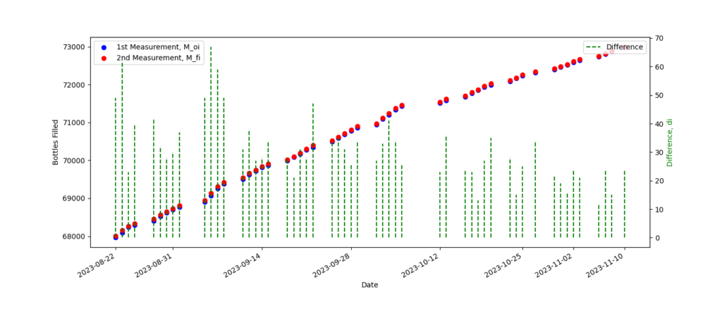
Here, we didn’t just plot the points but we also calculated the difference ‘di‘ between the first measurement of the day ‘Moi‘ and the second measurement ‘Mfi‘. That is the green vertical lines plotted above.
di = Mfi – Moi
We will define these differences ‘di‘ to be in litters, since each bottle was measured to be 1 litter. So, if we were to isolate these differences into its own graph, we should be able to compute the mean ‘μ’, the variance ‘σ2‘, and the standard deviation ‘σ’.
μ = n-1 · ∑di = 31.34 L
σ2 = n-1 · ∑(di – μ)2 = 135.2569
σ = 11.63
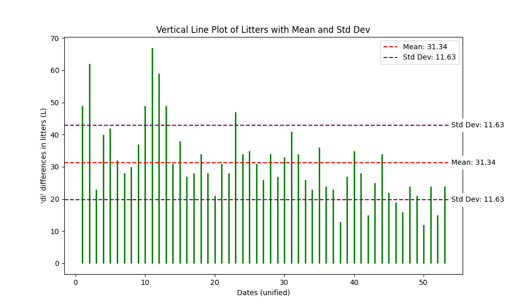
This data tells us that the average (mean ‘μ’) of bottles filled from 12h:00 to 16h:00 is around 31.34 litters. Additionally, it tells us that a difference ‘di‘ is considered high if it’s one standard deviation ‘σ’ above or below the mean. In this case, the standard deviation is 11.63 litters. Thus, implying that anything above 31.34 L + 11.63 L can be considered high, and anything below 31.34 L – 11.63 L can be consider low. This type of study is somewhat constrained in terms of what we can achieve with it. However, in the next section, we will take it a step further.
2.1 Water and temperature, regression interpretation
In this section, will invoke a simple linear regression using IBM, SPSS [4] software. We will attempt to study If there exists any relationship between the difference in litters filled ‘di‘ and the max temperature ‘Tmax‘ (from section 1.2) attaint that day. Here, ‘Tmax‘ will be our predictor independent variable and ‘di‘ will be our response. We will proceed under the assumption that the four conditions for a simple linear regression are satisfied. These conditions being: the presence of a linear relationship, independence between ‘di‘ errors, adherence to a normal distribution for these errors, and uniformity in their variances.


This regression analysis yields interesting observations. Specifically, an examination of the standard deviation ‘σ’ for the bottles reveals variation from the value obtained in the preceding Section 2. In the prior analysis, a standard deviation of σ = 11.63 was established. However, in this context, the standard deviation appears to align more closely with s = 11.74. This discrepancy arises due to the consideration of the data as a sample size by SPSS, resulting in the application of Bessel’s correction and the reduction of one degree of freedom. Consequently, the updated formulas are presented as follows:
sbottles2 = (n – 1)-1 · ∑(di – μbottles)2 = 137.9208
sbottles = 11.74
stemp2 = (n – 1)-1 · ∑(di – μtemp)2 = 54.5385
stemp = 7.38

When it comes to correlations, the deliberate selection of a unique predictor precludes the presence of multicollinearity, obviously. In fact, it was a strategic decision made in light of the strong inter-correlations of the weather data from section 1.2. Thus, we chose to exclusively focus on the maximum temperature variable.
However, the correlation between the predictor and the outcome has to be significant. In this case, we have a correlation of 0.729 between the temperature and the number of bottles filled. Since this is a brief study, we can say that it is significant enough for us to say that there exists a relationship between these two variables.

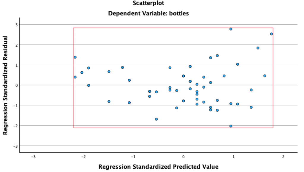
This P-P plot is important because it allows us to asses the normality of the residuals. In this case, we can see that the points attempt to follow the normal line thereby suggesting that the residuals are indeed approximately normally distributed. An assumption we did at the beginning of this section.
Moreover, the analysis reveals an absence of noteworthy outliers. While there are subtle deviations from the normal line, it is important to notice that these deviations quickly converge back to align with the expected distribution.
Residual statistics provides us with a visual summary of distribution and patterns of errors in this regression model.
It is important to notice that none of our standardized residuals (really z-scores) fall above our bellow +3 or -3 respectively. Thus, further implying that there exists not potential outliers. something, we had previously eyeballed.

The rationale behind the [-3, 3] interval stems from the empirical rule, which dictates that approximately 99.7% of observations in a normally distributed dataset lie within three standard deviations of the mean. Consequently, when the residuals are standardized (hence centring the plot at 0,0), they are anticipated to fall between the -3 to 3 range. Again, implying that the standardized errors are well within the bounds expected for a typical normal distribution.

Similarly, these standardized residuals can be examined with a histogram.
- This histogram roughly resembles a “bell shaped curve” thus providing legitimacy to the normality assumption.
- This histogram is centred at approximately zero ( mean = 1.56×10⁻¹⁶ ) because it has standardized the residuals correctly.
- The spread of the histogram looks very consistent. Thus, indicating homoscedasticity (standardized residuals have constant variance). Again, an assumption we had made at the beginning of this section.

When it comes to the model summary, we can see that R2 and Adjusted R2 are close in value. Thus, suggesting that most independent variables are contributing meaningfully.
Now, by evaluating the Adjusted R², we observe a value of 0.522. This signifies that 52.2% of the variance in the dependent variable is accounted for by the independent variables. While it may not represent a groundbreaking R², considering the simplicity of the model and the relatively modest sample size, it may suggests a partial association between the number of water bottles filled and the maximum temperature recorded on a given day.
2.2 Water, a planetary perspective
We have now completed a brief analysis of ‘water usage’ and its potential correlation with the daily climate conditions. Now, it’s time to see the whole picture and to make some observations.
μ = 31.34 L
y = 9.31 + 1.16x
R = 0.729
R2adj = 0.522
At Vanier College, the Elkay EzH2O dispenser consistently fills an average of 31.34 litters of water between the hours of 12:00 and 16:00. This means that the filter dispenses approximately 7.835 L per hour. We will expand on this in the later sections. For now, keep it in mind.
In our analysis of the linear regression model, using SPSS software, we derived the following equation: y = 9.31 + 1.16x. Alone, this formula tells us that there exists an upward trend, between temperature and number of bottles of water filled. Specifically, the positive slope suggests that as temperature increasers, the number of bottles also increases. In fact, it tells us that for every 10 degrees of increase in temperature, we should expect an increase of 11.6 litters of bottles filled. Obviously, this is not a perfect study and the selected linear regression model may not be the best choice. For example, what happens when the temperature reaches -9 degrees? does suddenly the number of people wanting to fill their bottles really become negative? obviously not.
let x = -9 °C
ynumber of bottles = 9.31 + ( 1.16 Litters / °C )·( -9 °C )
ynumber of bottles = -1.13 ?
Clearly, the model isn’t perfect, but that wasn’t the goal of this study. Our objective was to make the simplest study possible that would allow us to show that there exits a correlation between temperature and the number of bottles of water filled. In fact, using this simple regression model we found that the Pearson’s correlation coefficient is R = 0.729. But what does that mean? it means that, between the temperature and the number of bottles filled, there exists a 72.9% upwards correlation. Again, given the rather simplistic nature of this study, and the relatively small sample size, we are quite happy with the calculated Pearson’s correlation coefficient. Thus, suggesting that indeed there exists a potential correlation between them. These observations will be crucial in the later sections where we will forecast the faith of our planet using more modern, complex, and accurate modelling methods.
3 time series, time series analysis, and SPSS introduction
As previously mentioned, to attempt to forecast the future of our planet, we will need better tools and better methods than a basic linear regression. Here is where IBM’s SPSS software will become really useful thereby granting us access to a wider range of forecasting methods.

Enter time series analysis, a useful and quite powerful statistical technique used to analyze and interpret data points collected sequentially over time. For example, stock share prices, electrocardiograms, seismographic data, etc. All of these are examples of time series data, and to study them, we can preform a time series analysis.
When dealing with time series data analysis, we will encounter several components. For example:
- Trend:
- Trend refers to the overall direction of the times series. Basically, it looks at the long-term overall shape of our data and the patterns which can be upward, downward, or stable over time.
- Trends can easily be observed by visual inspection. However, there exist other techniques such as moving averages or polynomial fitting to understand the overall direction of the data. In fact, this is exactly what we did back in section 2.1 where we saw an upward trend in the number of bottles of water filled when temperature increased.
- Understanding trends is crucial for making informed decisions. It helps in predicting the general direction of future data points.
- Seasonality:
- Seasonality refers to periodic fluctuations or patterns in a time series data-sets which repeats at regular intervals. For example, every Christmas or during back to school time there might be an increase or rather spike in certain products. These are things we need to take into account, which are examples of seasonality. It’s important to notice that these seasonalities can be daily, weekly, monthly, or even seasonal.
- Similarly, seasonality is often identified through visual inspection. However, there exists better techniques such as decomposition, or statistical methods like Fourier analysis.
- Accounting for seasonality is necessary for accurate forecasting, especially in industries where demand varies with the time of year.
- Cycle:
- A cycle represents a repeating but not seasonal undulating pattern that is not necessarily of fixed frequency. Unlike seasonality, cycles are usually associated with economic or business cycles and may not have a consistent duration. For example, every certain amount of years a laptop manufacturer will sell more because of the life span of their devices.
- Unlike, seasonality and trends, identifying cycles can be challenging, and it often requires advanced statistical methods or domain knowledge.
- Recognizing cycles is important for understanding broader economic or business trends. However, it may not be as regular or easily predictable as seasonality.
- Residual or Noise:
- Residuals, also known as noise, are the random fluctuations or irregularities in a time series that cannot be attributed to the trend, seasonality, or cycle.
- Residual can be found by subtracting the predicted values from the actual values in a time series.
- Analyzing residuals helps assess the goodness of fit of a model. A good model should have residuals that are random and do not exhibit any patterns.
- Autocorrelation:
- Autocorrelation measures the degree of similarity between a time series and a lagged version of itself. It helps identify patterns or dependencies within the data. For example, if I have data for 8 weeks, I might just to use the first 7 weeks to predict the 8th, which is known, thereby better assessing the predictive model.
- Autocorrelation functions (ACF) and partial autocorrelation functions (PACF) are commonly used tools for identifying autocorrelation in time series data.
- Understanding autocorrelation is crucial for selecting appropriate models and identifying the order of autoregressive and moving average components in time series analysis.
Now that we know the principal components of a time series analysis, we need to take a look at the different types of forecasting models. Although there are several forecasting models, the most popular ones are the following:
- ARIMA (AutoRegressive Integrated Moving Average):
- Components:
- AutoRegressive (AR): This component refers to the dependence of the current observation on its past values. Basically, this is the part that takes autocorrelation in consideration, like we discussed above.
- Integrated (I): This component represents the differencing of the time series to make it stationary. If the original time series has a trend or seasonality, it will acknowledge it, preform differencing, and achieve stationarity.
- Moving Average (MA): This component involves smoothing out the noise by removing non-deterministic or random movements from the time series. Basically, it helps capture the short-term fluctuations not explained by the autoregressive component.
- Usage:
- ARIMA models are effective for time series data with a clear trend and/or seasonality. The selection of model parameters (AR, I, MA) depends on the characteristics of the data, often determined through autocorrelation and partial autocorrelation analysis.
- Advantages:
- ARIMA models are versatile and can handle a wide range of time series patterns. They are widely used for forecasting in various domains such as finance, economics, and of course, environmental science.
- Components:
- Exponential smoothing:
- Types:
- Simple Exponential Smoothing (SES): This type is good for time series without a trend or seasonality.
- Double Exponential Smoothing (Holt’s Method): This type is suitable for time series with a trend but no seasonality.
- Triple Exponential Smoothing (Holt-Winters Method): Suitable for time series with both trend and seasonality.
- Usage:
- Exponential smoothing models are particularly useful for short to medium-term forecasting and are suitable for time series with various patterns, including those that to exhibit seasonality, cycles, trends, etc. This type of model works by smoothing out the data, and giving weight to more recent values than older ones.
- Advantages:
- Exponential smoothing models are computationally efficient and easy to implement. They are adaptive and can be updated easily with new data.
- Types:
But how do we implement this? how do we know which type of forecasting model is best for our time series data? Well, although there are plenty of softwares that allow us to apply time series analysis, we have opted for IBM’s SPSS software. But, why?
- User-Friendly Interface:
- SPSS has a very intuitive user-interface, much like Excel and other data software, except of course, much more powerful. Furthermore, this proves advantageous for us as it eliminates the need for extensive programming, which would have otherwise prolonged the duration of this study.
- “Expert modeler” function:
- SPSS contains an ‘Expert Modeler’ function that automatically determines the best model for our time series data. So, basically, most of the time we wont’t have to worry about which forecasting model to use, seasonality, cycles, trends. SPSS will do the work for us, and at the same time, tell us which model it used, the patterns it saw, and why.
- Graphical Output:
- SPSS also provides us with a variety of graphical tools for visualizing the time series data and the results which we will need when attempting to study the climate data provided by NASA.
- Widely Used in Research and Academia:
- Lastly, SPSS has a long history of use in research and academia, and many researchers are familiar with the software. Thus, adding credibility to our study.
We now understand what time sires are, how to apply time series analysis, how time series analysis work, its components, and which software to use.
4 CO2 , a warm friend
Now, it’s time to take a deeper look at our planet. We will start by giving the warmest welcome to CO2, a heat-trapping gas, more commonly recognized as a greenhouse gas, who emanates primarily from the combustion of fossil fuels, such as coal, oil, and natural gas. Volcanic eruptions also contribute to the release of this gas into the atmosphere, further accentuating its presence and impact on Earth’s climate. In fact, even human breathing plays a role in the production of this gas, albeit to a lesser extent, but still adding to the mix of elements affecting our planet’s climate.
Let’s first take a look at how the CO2 concentration has changed with time.

This, is how the planet’s concentration of CO2 has changed since the year 1958. It is important to notice that this data calculations, according to NASA [5], were made from mid-troposphere which sits at around 10 km above land, and it was done by measuring the number of carbon dioxide molecules per million molecules of dry air. That said, the broader picture is clear, it has increased by at least 100 particles since then.
Clearly, the concentration also appears to have some sort of seasonality. If we look at the above sequence chart, we can see that the data isn’t smooth and there appear to be spikes in it. Let’s take a closer look.
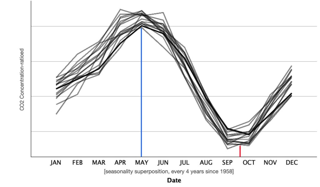
Here, we have superimposed the concentration change every four years. This is particularly interesting because it proves our original assumption regarding the existence of seasonality. There appears to be a maximum of concentration during the month intervals of [April, June]. Similarly, there appears to be a minimum through [September, October].
Now, it’s time to let IBM’s SPSS software make a 10 year forecast. We will tell SPSS to use a 95% confidence interval when calculating each prediction. Let’s take a look.


We have now forecasted 10 years ahead. The concentration by December of 2034, according to SPSS, should be between the ranges [438.99, 455.15]ppm with 95% confidence interval. Basically, it’s telling us that we will increase from January 2024 to December 2034 around [19.34, 34.27]ppm again with 95% CI. Clearly, things, aren’t looking good for us humans, but we will expand on this later.
Examining the effectiveness of a model in the context of time series can be somewhat tricky. Thus, we opted to for stationary R-squared (a refined metric that surpasses the conventional R-squared, particularly so because it takes into account trends or seasonal components of the series). That said, the interpretation is generally the same. Now, a stationary R2 value of 0.484 means that approximately 48.4% of the variance in the dependent variable is explained by the independent variable in our model. Not particularly a high number, but again, we are forecasting 10 years forward. In later sections we will explain why time series analysis fails for longterm predictions. That said, this model seems to fit our data fairly well.

So, SPSS has successfully predicted for us while using the “expert mode” mentioned in section 3. However, he did provide us with the technique, or rather “forecasting model”, it used.

SPSS used the “winters’ Multiplicative” method which is also called the Winter’s Exponential Smoothing method. Yes, a similar type of exponential smoothing as mentioned in section 3. In fact, it is an extension of Holt’s method, which itself is an extension of simple exponential smoothing. The significance of opting for the Winters’ Multiplicative method lay in its ability to address seasonality, something we had noticed way before running the forecast. Clearly, IBM’s SPSS took that into account.
There are certain key components of the Winter’s Multiplicative Method, these being:
- Level ‘l’: This represents the average value of the time series.
- Trend ‘b’: This accounts for… well… the trend of the time series. (direction and steepness).
- Seasonal Component ‘s’: This accounts for all the seasonal components.
The multiplicative method assumes that the components (level, trend, and seasonality) interact “multiplicatively”, meaning that the effect of each component is proportional to the others. But which formula did SPSS use? This one:
Yt + h = ( lt + h·bt ) x ( st + h – m·(k + 1) )
Here:
Yt + h = Forecast for time t + h
lt = The the Level at time t
bt = The trend at time t
st + h – m·(k + 1) = The seasonal component for time t + h and season ‘k’ (where m is the number of season in a year)
Winter’s Multiplicative Method became particularly handy because our time series data had both a trend and seasonality. It outperformed other methods like linear regression or exponential fitting. What made it stand out was how it factored in all the seasonal components, giving us results that beat anything we’d get from simpler approaches.
4.1 CO2, a planetary perspective
This is the part where we will study everything we’ve observed in section 4. We will begin by acknowledging the upward trend that the concentration of carbon dioxide has. It is, without a doubt, clear that CO2 levels are on the rise, and that they will continue to go up for as long as we don’t act upon it. As mentioned above, in the last 63 years we have increased around 100ppm in carbon dioxide levels. Right now, we are sitting roughly at 420ppm. Let’s take a planetary perspective by looking back in time.
During the Jurassic era, around 200 million years ago and renowned for its “warm, wet climate” [6], the concentration of CO2 ranged anywhere between 1800 and 2000 ppm, and the temperatures where 5 °C to 10 °C degrees warmer than the present day’s. Additionally, the extensive burning of terrestrial vegetation due to the warmth of the planet, made oxygen levels “15% lower” [7] than what they are right now. What this entails is that if we continue at the rate we are going right now, according to our calculations from above, we should expect to reach Jurassic-level climate in only 93 decades.
(rate of increase)-1 · ( Jurassic CO2 [ ]avg – initial value as of 2023)
(100ppm / 63 years )-1 · ( 1900ppm – 420ppm)
932 years
We’re talking about a scenario where, by the year 2955, life as we know it could be drastically altered, if not entirely un-livable. An increase in CO2 levels would mean a higher concentration of greenhouse gases and a warmer planet. Also, an increase in CO2, implies a potential decrease in O2 levels. Something essential for the survival of most living creatures. We’re not talking about a distant future here. While we might not be around to witness it, we’re looking at roughly 11 generations from now, that won’t have a planet—a livable planet, that is. And is not until then that we will suddenly feel the effects of carbon dioxide increase. In fact, just now we are hitting record temperatures, mass ocean warmings, droughts, flooding, and extreme conditions. Now imagine just how life will be 5 generations ahead. If someone where to ask you if you wanted to travel to the future or the past, i’m sure now you’ll double take before answering. Think about it, the mass droughts will kill most plants and crops. What will we eat? What will we breathe? Plant’s and plankton, are what brings us oxygen. In fact, during our study, we saw in section 4 that CO2 concentrations had seasonality. But why? why does CO2 levels peak through April and June and then quickly descend? and why does it all start going back up during October? Well, an explanation could be that, during spring, plants are germinating again and, through photosynthesis, they’re chemically converting the carbon dioxide into breathable oxygen. Similarly, during fall, plants stop their production of oxygen in preparation for the winter. Another possible explanation for this seasonality could be the reduced overall use of fossil fuels and natural gases in the summer. After all, it’s no secret that we tend to consume more energy during the winter months.
This was CO2, a planetary perspective. In the future sections, we will study the rest of the climate data. Perhaps, we will come to newer conclusions or reinforce the already stablished ones.
5 Methane, a toxic commodity
In this section we will expand on CH4, the second-largest contributor to the planet’s warming right after CO2. Methane happens to be another natural greenhouse gas with a relatively short life-span of 12 years, that is if compared to CO2 which can last for hundreds of years. It is important to know that methane isn’t just nature doing its thing; we humans play our role too, contributing to about 60% of the methane in the atmosphere. The troublemakers? Well, it’s our farming practices, the way we go after fossil fuels, and even the garbage breaking down in landfills. The rest of the methane, about 40%, comes from natural processes, with wetlands and permafrost being the MVP’s.
Let’s first take a look at how the methane’s concentration has changed with time.

This is how the concentration of methane has changed over the years since 1984. It is important to notice that this data calculations, according to NASA [8], were measured using the Airborne Visible InfraRed Imaging Spectrometer – Next Generation, or AVIRIS-NG, mounted on to planes. However, since 2022, NASA also started collecting this data directly through the ISS using another infrared instrument which detects the peculiar reflection methane emits. Nonetheless, methane emissions are clearly going up. Increasing by roughly 267ppb in the last 38 years.
Unlike CO2, the concentration of methane through time appears to have no seasonality. If we look at the above sequence chart, we see that the data isn’t really smooth but it also doesn’t have any spikes in it. This is not due to the fact that methane has no cycles or seasons, but rather due to the type of data. The data used for this section is collected yearly. Thus, any potential seasonality throughout the year is missed.
Now, it’s time to forecast 10 years ahead. Again, we will tell SPSS to use a 95% confidence interval when calculating each prediction. Let’s take a look.


This is a 10 years forecast. The concentration by 2034, according to SPSS, should be between the ranges [1969.90, 2248.20]ppb with 95% confidence interval. Basically, it’s telling us that we will increase from 2023 to 2034 around [49.96, 314.75]ppm again with 95% CI. Once again, things, aren’t looking good for humanity.
It is evident that the lack of cycle and seasonality really puts pressure to the time series forecast. Not only do we obtain a relatively low stationary R2 of 0.223, but we also see a curve that has almost no complexity, it’s just a straight line. This is, however, about as good as it gets. No other methods will enhance the performance of the test, unless more predictors are added to the equation. But, for now, this time series delivers a formidable forecast with the data at hand, basing itself on more recent data.

SPSS ‘expert mode’ provided us with a forecast, but this time it used a different forecasting method. For this occasion, IBM’s SPPS used ARIMA (2, 2, 0). Let’s expand on this topic.

We’ve already talked about what ARIMA is back in section 3. However, this time SPSS provided us with a type (2, 2, 0) for each AR, I, MA component respectively. But what does that all mean?
Let’s start by writing down the formula of the ARIMA (2, 2, 0) model:
(1 − ϕ1·B − ϕ2·B2) · (1 − B)2·Xt = (1 + θ1B + θ2B2)·εt
- AR (2):
- Here ‘2’ represents the number of autoregressive terms in the model. Autoregressive terms involve predicting the future value of a time series based on its past values, sort of like focusing on the last parts of the curve only.
- This (1 − ϕ1·B − ϕ2·B2) part of the equation is the autoregressive part where ϕ1 and ϕ2 are the autoregressive coefficients for lag 1 and lag 2, respectively.
- I (2):
- Here ‘2’ is the degree of differencing. This represents the number of times the raw observations are differenced to make the time series stationary. (remember, a stationary time series has a constant mean and variance over time).
- This part (1 − B)2·Xt represents the differencing component. The (1 − B)2 part indicates second-order differencing, as I = 2 in ARIMA(2,2,0)
- MA (0):
- Here ‘0’ is the number of moving average terms in the model. Moving average terms involve modeling the relationship between an observation and a residual error from a moving average model applied to a lagged observations.
- This (1 + θ1B + θ2B2)·εt part of the equation represents the moving average part of the model where θ1 and θ2 are the moving average coefficients for lag 1 and lag 2, respectively.
- εt is just the white noise error term at time t. It represents the random and unpredictable component of the time series that is not explained by the autoregressive and moving average components.
Basically, this model makes predictions based on the patterns observed in the last two time points, after differencing the time series data twice to stabilize its statistical properties. This was particularly, useful given that the data had no record of seasonality.
5.1 Methane, a planetary perspective
Similarly to carbon dioxide, section 5 has shown us that methane is rising with time. Thus, introducing yet another greenhouse gas to our collection of concerning global warming phenomena. But let’s take a planetary perspective and study the effects and dynamics of methane and its potential ramifications as an increasing compound on Earth’s lithosphere and atmosphere.
It’s no secret that us humans play a big role when it comes to methane emissions (but then again, what don’t we play a role in). Most of our commodities and practices demand transportation, energy, and fuel. But at what cost? Well, at a very high one. Ironically, instead of caring for what’s actually real, humans care too much about intangible things such as a made up numbers. We call these numbers “currency”. Therefore, we often opt for the cheapest method, and the cheapest method is often the most harmful one. For instance, coal production is a big contributor to methane levels in our atmosphere. Coal, as an energy source, is used since the 16th century. Forward almost 400 years, and we’re still using it. But why? because “coal-fired power plants provide affordable, reliable and constant power that is available on demand to meet energy consumption needs” [9]. Notice two things here, the website that explains why coal is still used, relied on two words “affordable” and “demand”. In today’s society, those two words trigger causality. ‘If we have a demand, it better be affordable, otherwise we’re not making profit’. This type of thinking will bring humanity to a collapse, and it the process, it’ll take the planet with it. In fact, according to our predictions from section 5, by the year 2034 the concentration of CH4 will be approximately 179 parts per billion higher than what they are right now. We’re currently sitting at 1930 parts per billion. Venus, the second planet of our solar system, has a CH4 planetary concentration of roughly 3000000ppb, that means that if we subtract the current initial value of CH4 and we divide by the 179ppb rate-increase seen in our prediction, we should have about 16,750 years left until we turn into a Venus-like planet. Thus, reaching temperatures of up to 500 °C. Yes, Venus is closer to the Sun than Earth is, and there exists a variety of other factors why the temperature might be higher, but methane (a heat-trapping gas) definitely contributes to it. That said, the probability of Earth still being Earth as we know it by the year 18,773, seems very low. Latest human behaviour and mindset has me worried for our future, but I’m not here to talk about our primitive nature. I’m here to show you what will happen if we don’t do anything.
6 World temperature, an increasing fever
Climate change, we hear it everywhere. it’s on the news, it’s online, it sees you when you’re sleeping, climate change it’s coming to town. In all seriousness, climate change is an important topic. Many people confuse weather and climate change, but these are two different things. Weather is how the temperature is outside right now, yesterday, or tomorrow. For instance, in France, the weather right now could be 10 degrees celsius and cloudy, but farther south, on the other side of the world, Brazil might be experiencing clear skies and 30-degree weather. This is all possible because different places have different climates. Right before winter, those of us who are in the northern hemisphere have probably witnessed the American Goldfinch or the Canadian Geese flying south. They’re searching for a place with different climate. Yes, the weather will be different, but they know that the climate southbound is usually warmer. So, what’s climate change then? well, “climate change is a change in the usual weather found in a place. This could be a change in how much rain a place usually gets in a year. Or it could be a change in a place’s usual temperature for a month or season” [10]. In fact, even the planet has its own climate when we take into consideration the sum of all climates around the globe. This, is all important to know because, first, we will take a look at how the global climate has changed with time.

This is the global average of the surface temperature of planet Earth since the year 1850. As we can see, the planet has been slowly increasing its yearly mean temperature. It went from averaging -0.16 °C (31.7 °F) in 1850, to a melting 0.91 °C (33.7 °F) in 2022.
This is the same global average surface temperature but presented differently. This is a sequence chart and it allows us to visually estimate the trend of the time series. Clearly, this time series demonstrate an increasing slope thereby suggesting that the planet is, indeed, getting warmer.

Now, it’s time to do the usual and let IBM’s SPSS take a leap into the future and forecast 10 years ahead by analyzing our time series data using a 95% confidence interval.


This is how the planet’s climate will change in the next 10 years. Using the upper and lower confidence levels we can say with 95% confidence that the planet will increase its temperature somewhere between [0.03, 0.4] degrees celsius. Yes, this doesn’t seem like a huge increase, specially when it took 10 years, but in the following section we will explain why this is a big deal. Overall, however, the trend seems to show that the surface-climate is increasing.
As we already know, a stationary R2 value of 0.589 using Brown’s forecasting method indicates that approximately 58.9% of the variability in our dependent variable is explained by the model. Visually it makes sense. The model has, once again, focused on more recent data and has forecasted accordingly. Hence why we see a simple line projected forwards.

For this test, we used SPSS on ‘expert mode’ again. However, it failed. The lack of cycle, and seasonality really put pressure to the model. So, we had to step in and manually check all time sires data analysis methods. Ultimately, the best overall method was the Brown’s forecasting model. Let’s take a look.

This is the Model’s description and it confirms that, to forecast, it used the Brown’s model. Let’s expand on that.
Brown’s Exponential Smoothing, also known as double exponential smoothing with damping, is useful in situations where time series data exhibits a trend, but no seasonality, and is expected to decrease or increase gradually over time. This method is particularly valuable for us because our Global Mean Temperature time series data didn’t exhibit any clear seasonality, however, the overall trend was increasing.
Here are the key components and formulas for Brown’s Exponential Smoothing:
- Level (lt):
- This represents the smoothed value of the time series at time t.
- Trend (bt):
- This represents the smoothed trend at time t.
- Damping parameter (ɸ):
- The damping parameter is used to control the damping effect on the trend over time. It is a value between 0 and 1, where 0 means no damping and 1 means full damping.
The forecast equation for Brown’s Exponential Smoothing looks like this:
Yt + h/t = lt + ɸ · h · bt
The smoothing equations are updated as follows:
- Level update:
- lt · ⍺ · yt + ( 1 – ⍺ )·( lt-1 + ɸ · bt-1 )
- Trend update:
- bt = β · ( lt – lt-1 ) + ( 1 – β ) · ɸ · bt-1
- Forecasting update:
- Yt + 1 = lt + ɸ · bt
where:
- Yt is the actual value of the time series at time t
- ⍺ is the smoothing parameter for the level.
- β is the smoothing parameter for the trend.
- lt-1 and bt-1 are the level and trend values at the previous time step.
- h is the forecast horizon
6.1 World temperature, a planetary perspective
So far, we have only analyzed greenhouse gases. Now, in this section, we will see the consequences of the accumulation of these heat-trapping gases in our atmosphere. It’s not easy to miss. Join us through this planetary perspective to understand what it all means if the world keeps getting hotter.
Let’s start by acknowledging the biggest jump in temperature that we saw from the year 1850 to 2022. In just 172 years, the planet rose by a staggering 1.07 °C (2°F). If it doesn’t seem like a lot, it’s because our brain can’t interpret the magnitude of this number. Try not to look it by its singular value of ‘one’. In fact, let’s look at it from an energy perspective. How much energy would it be required to increase the temperature of 3.86 × 10¹⁸ kg, the mass of planet Earth’s troposphere, by 1.07 °C? Probably a lot, right? This means that the planet has “extra heat” which has accumulated and it’s now contributing by warming up the planet. Global warming.
If we take the global temperature change (1.07 °C) and divide it by the number of years that it took for it to get there (172 years) we get a rate of increase of approximately 0.006 °C/year. At that rate, we would achieve Jurassic level temperatures, which ranged 5 °C to 10 °C higher, in approximately 110 decades. Keep in mind that this is a really rough estimate based on 172 entries only and assumed to be linear.
( rate of increase )-1 · ( (JurassicTavg °C) + (current initial global climate value as of 2023))
( 0.006 °C/year )-1 · ( 7.5 °C + 0.91 °C)
1400 years
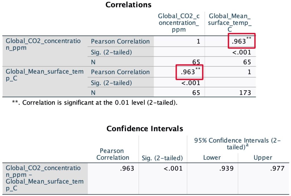
But wait, how does that compare to our previous prediction from section 4.1? our previous prediction said that the concentration of CO2 would reach Jurassic levels in approximately 932 years. Now, we are saying that temperature of the planet would reach Jurassic levels in approximately 1400 years. They are oddly close in value. Let’s take a look through SPSS to see if these two variables are correlated.

This scatter plot allows us to visualize the global temperature of the planet and the CO2 concentration in the atmosphere as a function of time. Keep in mind, we’re not implying causality. Clearly, however, there appears to be a linear relationship between variables. So, let’s run a Pearson correlation coefficient in SPSS and thereby asses the strength of the potential relationship.
After running a Person’s correlation test we found a correlation of 0.963 which indicates a strong positive linear relationship between CO2 concentration and global surface temperature. This suggests that as CO2 levels increase, there’s a substantial tendency for the global surface temperature to rise. We should, however, keep in mind that correlation doesn’t necessarily imply causation, but our findings indicate a noteworthy relationship between these two variables.
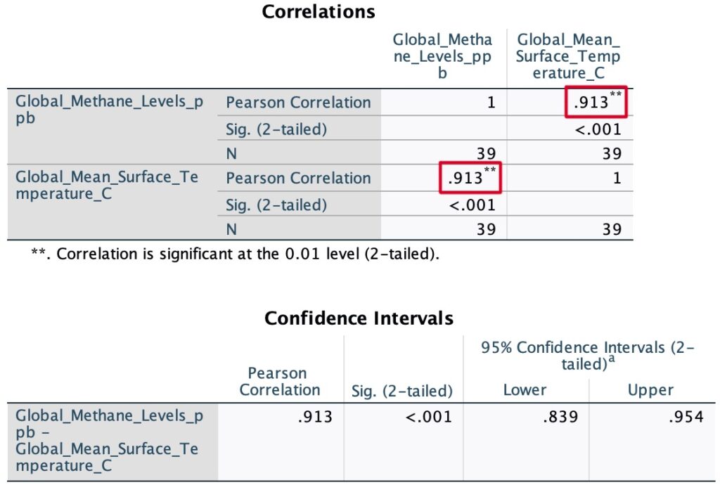
Throughout this study, we found substantial evidence suggesting that substances like CO2 can warm up the planet by trapping heat. Thus, giving us a clear example of what we commonly associate as the greenhouse effect. If this is true for CO2, then the following question arises: is this relationship also true for Methane? Let’s evaluate.

This scatter plot allows us to visualize the global temperature of the planet and the CH4 concentration in the atmosphere as a function of time. Again, we should keep in mind, we’re not implying causality. However, just like presumed, there appears to be a linear relationship between variables. So, let’s run another Pearson correlation test in SPSS.
After running the Person’s correlation test we found a correlation of 0.913 which also indicates a strong positive linear relationship between methane concentration and global surface temperature. Just like with CO2, this suggests that as methane levels increase, there’s a tendency for the global surface temperature to rise. Clearly, our findings are indicating yet another possible variable affecting climate change.
It is important to notice that we haven’t really proven causation here. To do so, we would need to explore dependency between our variables. Luckily, we’ve already done something similar back in section 2.1 where we ran a regression analysis between the max temperature of a given day and the number of bottles of water filled. Here, similarly, conducting a regression analysis would be extremely valuable. It would allow us to understand the quantitative relationship between our variables, thereby offering insights into how changes in CO2 and CH4 levels might impact temperature.
Since we would be assessing two variables at the same time, it would be pretty handy to run a multiple linear regression model in SPSS. However, running a multiple linear regression implies making several assumptions. These being: linearity, independence, homoscedasticity, normality of residuals, and no perfect multicollinearity. All of these, we have previously explained except multicollinearity which says that predictor variables should not be perfectly correlated with each other. Unfortunately, when we assess the multicollinearity between CO2 and CH4 by examining their correlation matrix we observe that their Pearson correlation is pretty high. Thus, indicating a potential multicollinearity.

This scatter plot allows us to visualize the concentrations of CO2 and CH4 in the atmosphere as a function of time.
The Person correlation test gave us a correlation of 0.969 which indicates a strong positive linear relationship between the two variables. In this context, the high correlation suggests multicollinearity, which might impact the stability and interpretability of the multiple regression model. So, we won’t run it.

Instead, we will only choose the CO2 variable since it is the most relevant to climate change. After all, it can last for thousands of years and accounts for 80% of all greenhouse gases in the atmosphere. So, let’s quickly run another simple linear regression and asses the findings.


These are the linear regression statistics worthy of being studied. It would be trivial to reassess things such as correlation, linearity, etc. We’ve done this already. Regardless, as we can see, we obtained an R square value of 0.927. It indicates that approximately 92.7% of the variability in the mean surface temperature can be explained by the linear relationship with CO2 concentrations. Also, a worthy remark is the best fitted line formula y = -3.21 + 0.01x. However, we will expand on this later.
The residual statistics show us that none of the standardized residuals fall above our bellow +3 or -3 respectively. Thus, implying that the standardized errors are well within the bounds expected for a typical normal distribution.


This P-P plot is somewhat controversial. Most of the residuals aren’t inside the normal line. However, we should keep in mind that they do seem to converge into it. Thus, indeed, suggesting that the residuals are normally distributed.
Throughout this paper, we have successfully shown that CO2 levels and mean surface temperature have a strong, positive, and increasing relationship. It’s time to take a serious planetary perspective. Something concerning is worthy of our attention. Let’s take a look at the linear regression formula provided above.
y = -3.21 + 0.01x
Where:
- y = Predicted global mean temperature (°C)
- x = Predicted global CO2 concentrations (ppm)
With this formula, we are now able to predict all possible outcomes. We have all the necessary tools and methods. This formula is concerning due to its steepness. Yes, 0.01 °C/ppm doesn’t seem like a lot, but the rate of increase of CO2 concentration levels is pretty fast, and we’re able to predict that too (assuming nothing changes and, of course, remaining skeptic of the accuracy of long-term predictive modelling). In fact, let’s do that. Let’s evaluate when will we reach mean temperatures just like back in the Jurassic era (7.5 °C higher than what they are right now).
- Current global mean temperature as of 2023:
- Yo
- Jurassic era estimated global mean temperature:
- YJ = Yo + 7.5 °C
YJ = Yo + 7.5 °C
YJ = 0.91 °C + 7.5 °C
YJ = 8.41°C
YJ = -3.21 + 0.01X
(YJ + 3.21) · (0.01)-1 = X
(8.41°C + 3.21) · (0.01 °C/ppm)-1 = X
1162 ppm = X
According to this calculation, as we reach a global mean surface temperature of 8.41°C (which is the estimated temperature back in the Jurassic era), we will have a CO2 concentration of approximately 1162 ppm (based under the unrealistic assumption that nothing changes, of course). But, what about the “when will we reach these 1162 ppm” question? Well, to answer this, unfortunately, we cannot use SPSS time series analysis like we did before. Time series analysis are not particularly good at forecasting in the long-term. Long-term predictions are susceptible to higher levels of uncertainty and if we were to use it, answering the question “when” will yield a very big interval answer; and while that is statistically correct, it doesn’t provide an “answer”. Here, we are looking for a rougher estimate that follows the current trend. Thus, we opted for a polynomial best fitted line to answer this question while being careful not to “overfit”. Of course, overfitting being the popular phenomenon where a model learns the training data too well thereby capturing noise or random fluctuations as if they were genuine patterns. This can lead to poor generalization to new, unseen data. So, to avoid drawing an elephant [11], let’s only use 3 parameters for our best fitted line.


This is the best fitted line for our data points. And the formula looks as follows:
314.149726017907 + 0.06958879036777775x + 7.206514912487167e-05x2 + 1.624948026515723e-08x3.
For better visualization, we expanded the scale of the curve. That said, with this new formula, finding the respective date for a CO2 concentration of 1162 ppm will be as easy as finding the roots of the above function.

To solve for the roots, we will spare you the math and just provide a code snippet using Python. With it, you can also find any date or concentration you desire.
# find the approximate date 'x' based on the concentration 'y'

from scipy.optimize import fsolve
import numpy as np

# Define your Concentration in ppm (i.e we want to know the date for 1162 ppm)
y = 1162

# Define the polynomial function
def equation(x):
    return 314.149726017907 + 0.06958879036777775*x + 7.206514912487167e-05*x**2 + 1.624948026515723e-08*x**3 - y

# Initial guess for the root (you may need to adjust this by looking at the graph above)
initial_guess = 2400

# Use fsolve to find the root of the equation
solution = fsolve(equation, initial_guess)

# Transforming the month date into the a readable year value.
solution_adjusted = (solution[0])/12 + 1958.3

print(f"As we reach {y} ppm, we will be, roughly, by the year: {solution_adjusted} ")
# Find any approximate concentration desired 'y' given a certain date 'x'

# Choose the date (in years i.e in 2034)
x = 2034

# Transforming the date into an accepted month terminology based on the inital value of March 1958 = month zero
x_adjusted = abs(1958.3 - x)*12

# Solving for the concentration 'y'
y = 314.149726017907 + 0.06958879036777775*x_adjusted + 7.206514912487167e-05*x_adjusted**2 + 1.624948026515723e-08*x_adjusted**3

print(f"the approximate concentration for the year {x} is: {y} ppm")
Using the above code, we can finally answer the question. So, when is it then? Well, according to our polynomial, we should be reaching these temperatures by the year 2163 (under a lot of assumptions). This is an alarming result. The date is much more closer than expected. We went from a prediction of 1400, to just 140 years. That’s roughly two generations from now. However, that’s not a problem for them to solve, this is our job. This whole study is based under the pessimistic and unrealistic assumption that factors influencing climate change will remain constant. In reality, human actions and global initiatives aimed at mitigating climate change can significantly impact the trajectory of these predictions. The responsibility to address and mitigate these potential outcomes lies within us, the current generation. Else, picture massive droughts, intense heat waves, big floods, more prominent hurricane seasons, longer incessant wildfires, melting permafrosts, rising methane levels -All because the planet will keep getting hotter.
In the following sections, the analysis will narrow its focus to the Arctic region, exploring the specific impacts of climate change on, perhaps, the most vulnerable ecosystem. As we will learn, the Arctic plays a crucial role in regulating global climate patterns which will have repercussions on the world’s oceans.
7 Arctic ice minimum extent, a melting pot of problems
So far, we have analyzed greenhouse gases and their effects on global warming. Now, we will transition to a closer examination of the consequences of global warming, with a particular focus on the vulnerable Arctic region which itself promotes a spectrum of challenges, from the impact on Arctic ecosystems and wildlife to the repercussions felt globally, including altered weather patterns and rising sea levels.
Let’s start by observing how the Arctic ice has changed with respect to time.

This graph shows us how the area, in millions of squared kilometres, has changed with time. According to NASA, these records were taken via satellite imagery every September since the year 1979, by studying individual pixels that are at least 15% covered in ice.
This is another graph that allows us to visualize the change in terms of actual area. Here, the Z axis is the year, and the XY axis are units in million of kilometres.
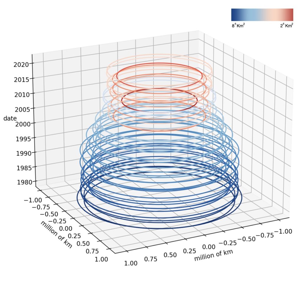

For a better visualization of the change in area, we traced all the circles into the XY axis. The shades of blue denote larger areas, while the red hues signify the much smaller and concerning ones.
As time progresses, it is crucial to observe the diminishing trend of the Arctic ice extent.
As usual, we will now attempt to forecast 10 years ahead using SPSS software.


This is a 10 year forecast of the Arctic ice extent. By the year 2034, we should have an Arctic ice area between [4.54, 1.98]x106 km2 with 95% confidence interval. What this tells us is that from the year 2023 to 2034 we should expect a decrease in area by [1.06, 0.64]x106 km2 again with 95% CI. The important takeaway here is that, according to our calculations, the Arctic ice extent is shrinking with time.
As we already know, a stationary R-squared value of 0.793 suggests that the model explains about 79.3% of the variance in the observed data. As expected, the forecast anticipated a negative slope.

Similar to when we were attempting to forecast mean surface temperature, forecasting Arctic ice extent 10 years ahead proved to be, once again, challenging to SPSS time series analytics. The lack of cycle, seasonality, and the relatively small sample size made it so that most modelling methods wouldn’t work. Except, of course, Holts method.

Here, we are confirming the usage of Holts model. This method, also known as double exponential smoothing, is a time series forecasting technique that extends simple exponential smoothing to handle time series data with trends.
Holt’s method involves two smoothing parameters: one for the level of the series (often denoted by α) and another for the trend (often denoted by β). The forecast at time t+h is given by the sum of the level at time t and h ‘times’ the estimated trend at time t. The formulas for updating the level and trend are as follows:
- Level update:
- Lt = α⋅Yt + (1 − α)⋅(Lt−1 + Tt−1)
- Trend update:
- Tt = β⋅(Lt − Lt−1) + (1−β)⋅Tt−1
- Forecast:
- Ft+h = Lt+h⋅Tt
Where:
- Yt is the actual value at time t.
- Lt is the level (smoothed value) at time t
- Tt is the trend at time t.
- α and β are the smoothing parameters, both between 0 and 1.
- Ft+h is the forecast at time t+h.
Holt’s method is particularly useful when the time series data exhibits a linear trend. Or, in our case, when the time series data doesn’t have a cycle or seasonality, but it has a clear trend. If it would have had a cycle or seasonality, then it would have implemented Holt-Winters method like we did in section 4. Regardless, both methods are part of the family of exponential smoothing methods commonly used in time series forecasting.
7.1 Arctic ice minimum extent, a planetary perspective
This section of a planetary perspective will focus on the repercussions from the melting of the Arctic ice, examining the impact in both human societies and the natural environment.
Let’s start by attempting to show that global warming is a contributor to the melting of the polar caps. Once again, let’s run a correlation test between these variables.

Here, we have simply plotted the global mean surface temperature vs Arctic ice extent with respect to time. Notice, the points seem to decrease as global mean surface temperature increases. This could indicates a potential inverse relationship between variables.
After running a Pearsons correlation test, we obtain a value of -0.847 which would indicates a strong negative relationship, supporting the idea that as global temperatures rises, Arctic ice extent tends to decrease. However, this was expected, it aligns with the broader understanding of the impact of global warming on polar ice. Nevertheless, showcasing it in this study adds empirical support thereby adding credibility to the old narrative.

Now that we’ve identified one of the primary contributors to the melting of polar ice caps, let’s delve into the harmful effects that this thawing can have on our planet. To do so, let’s begin by examining the most substantial leap in area change that we’ve ever had.
In 1980 we had an Arctic ice area of approximately 7.544 x 10⁶ km2. In 2012 we achieved our lowest area ever recorded with only 3.387 x 10⁶ km2. If we do a simple subtraction of those two numbers, we would obtain a value of 4.157 x 10⁶ km2. This is just an area change comparison, but it’s important because it highlights one of the biggest problems -All of this 4.157 x 10⁶ km2 of ice, times its depth, had to go somewhere. But where? And the answer to that is what brings us problems. You see, the Arctic ice melting has a couple on inconveniences attached to it. Of course, these being: rising sea levels, loss of habitat for certain animals, disruptions to global climate patterns, contributions to extreme weather events, and it threatens coastal communities. Let’s expand on some of these.
- Rising sea levels:
- According to NOAA, global mean sea levels have risen between 21 and 24 centimetres since 1880 [12]. Also according to them, the rise in sea levels is due mostly because of melting glaciers, ice sheets, and thermal expansion of sea water. These rising sea levels, would increase coastal floods thereby jeopardizing densely populated areas and essential infrastructure, leading to the displacement of communities and economic losses. The loss of coastal habitats, including mangroves and estuaries, endangers diverse ecosystems thereby disrupting breeding grounds and shelter for numerous species. Biodiversity faces a critical challenge too since species will struggle to adapt to rapidly changing conditions, risking extinction. Similarly, fisheries, vital for human nutrition, will be incredibly affected by altered ocean conditions. Additionally, saltwater intrusion into freshwater systems compromises agriculture, diminishing crop yields and threatening food security. Even our health could be compromised.
- Permafrost:
- A permafrost is a mixture of soil, gravel, and sand bounded by water which has remained frozen for more than two years, either on land or below the ocean floor [13]. Permafrost is usually found, however, in areas where the climate is mostly above freezing. Thus, implying that it can often be found near Arctic regions. There exits plenty of negative impacts that come with the melting of the Arctic caps. For example, land erosion and the previously studied rising of the sea levels. However, the biggest issue remains the impact that it has on the Earth’s climate. The thawing of permafrost results in the release of large amounts of carbon dioxide and methane into the atmosphere; and we already know what these greenhouse gases are capable of.
- The following graph attempts to show the correlation between Global mean CO2 levels, Global mean CH4 levels, and Arctic ice extent. As we will clearly observe, it will appear as though the melting of the polar caps has a definite impact on the concentration of greenhouse gases in the atmosphere. Keep in mind, we’re not implying causality and that this graph is not a function of time but rather a function of area. However, the negative correlation, the downwards slope, and the visual aspect of the graph, clearly demonstrates that as the Arctic ice extent decreases, the concentration of greenhouse gases appears to be bigger. Similarly, the opposite is true. For an increasing Arctic ice area, the concentration of greenhouse gases appears to be smaller. While there are definitely other factors affecting the concentration of our atmosphere, this is a solid first step at demonstrating that, indeed, the melting of the polar caps has a negative impact on the atmosphere, the planet and its climate.

- Global warming:
- As the ice melts, it reduces the Earth’s surface reflectivity, allowing more sunlight to be absorbed by the darker ocean water. This, in turn, amplifies the warming effect and contributes to a feedback loop of increased temperatures. It’s a concerning factor. In fact, the following section will study how the ocean temperature has changed with time.
8 Ocean temperature, an imminent hot tub
In this section we will study the ocean, specifically its internal heat change with respect to time. We will also attempt to analyze the rising concerns associated with the escalating changes in oceanic thermal patterns.
Let’s start this section by observing how the World’s, Southern, and Northern ocean average heat has changed with time.
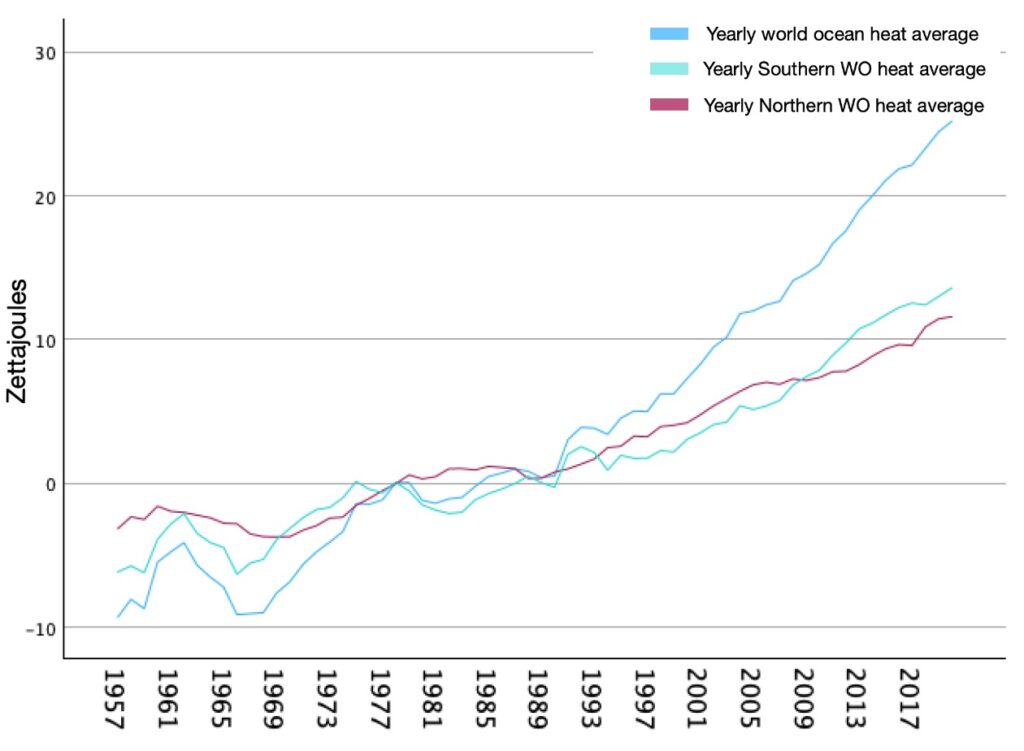
This is a sequence chart, in Zettajoules, showing yearly changes in ocean heat since the year 1957. According to NASA, these observations were captured using satellite and advanced ocean measurement technologies. Regardless, the overall trend is clear. The ocean heat change is getting bigger each year, thereby implying that the oceans are getting hotter. As captured in the graph, this is true for Southern, Northern, and, overall, the world ocean.
Now, it’s time to let SPSS do a 10 year forecast. We will only focus on the World and Northern ocean data since it’ll facilitate the comparisons we will make in the upcoming planetary perspective section. Similarly, it will give priority to localized studying, something essential for a better and more accurate understanding.


This is a 10 year forecast of the World Ocean heat content. In the year 2034, we should expect to have a planetary Ocean heat content that rose between the ranges [8.59, 67.01] Zettajoules with 95% confidence interval. What this tells us is that from the year 2021 to 2034 we should expect an increase in heat content which would be the sum of the intervals from 2021 to 2034. However, the important takeaway here is that, according to our calculations, yearly ocean heat content appears to be increasing with time.
As usual, a stationary R-squared value of 0.304 would suggests that the model explains about 30.4% of the variance in the observed data. As for the model’s description, here we’re confirming that, to forecast, SPSS used the Brown’s model which makes sense given the data. We won’t explain why again, but if you would like to learn, refer back to section 6.


This is another 10 year forecast. However, this time is for the Northern Ocean heat content. In the year 2034, we should expect to have a Northern Ocean heat content that rose between the ranges [7.98, 28.33] Zettajoules with 95% confidence interval. Again, the important takeaway here is that, according to our calculations, yearly Northern ocean heat content appears to be increasing with time.
A stationary R-squared value of 0.449 would suggests that the model explains about 44.9% of the variance in the observed data. As for the model’s description, SPSS used the Brown’s model. Once again, this makes sense given the data provided.

8.1 Ocean temperature, a planetary perspective
In this section, we will attempt to understand what it means and what it entails if our oceans keeping getting warmer. Thus, hopefully, allowing this planetary perspective to remind us that we owe everything to the ocean.
As of current technology, it is impossible to know where and how exactly life began. However, many theories suggest that life started deep inside the ocean, approximately 3.7 billion years ago. As of now, scientists suggest that the oceans houses nearly one million species out of which 2/3, or possibly more, are yet to be discovered. Just for a planetary perspective, about 2000 new ocean species are accepted yearly by the scientific community [14]. Further emphasizing the significance of the ocean, an estimated (50, 88)% of Earth’s diverse array of living creatures call the ocean their home [15]. It then becomes imperative to understand the critical importance of prioritizing the protection and preservation of the oceanic environment, given its integral role in sustaining a substantial portion of Earth’s biodiversity and thereby its ecological balance.
Unfortunately, as we have previously seen, our data is telling us that the world oceans are getting warmer. According to NASA, “about 90% of global warming is occurring in the ocean” [16]. Previously, in the world temperature section, we made an “energy observation”. We said that to heat up the planet by 1.07 °C (the increase in world climate since 1850) we would need ludicrous amounts of energy. What we didn’t mention is that if we were to “heat up” the planet to rise its temperature by 1.07 °C, most of the energy used to “heat it up” to that temperature, would be absorbed by oceanic water, which covers roughly 70% of the Earth’s surface. It’s crucial to remember that water possesses the highest specific heat capacity of any liquid, indicating that any energy increment introduced into the system, will mostly be absorbed by water. Assuming these increments in oceanic heat content come from climate change, then the previous “energy observation” becomes not only obsolete but also laughably unrealistic. It thereby suggests that, to heat up the planet by 1.07 °C while taking into consideration the fact that oceanic waters will absorb most of the heat, we would then need an absurd and almost nonsensical amount of energy. Recall that:
1 ZettaJoule = 1×10²¹ Joules = 2.39×10²⁰ Calories
Also, according to our data, from the year 1957 to 2022, the world ocean experienced an increase of 256.50 ZettaJoules +/- its respective CI, of course. Regardless, this small period of 6.5 decades has collected enough energy in the world ocean to increase a calculated 6.1305×10⁷ km3 of water by 1 degree celsius.
256.50 ZettaJoules = 6.1305×10²² calories
Q = mcΔT
m = (c⋅ΔT)-1⋅Q
m = (1 calorie/gram°C⋅1°C) -1⋅ 6.1305×1022 calories
m = 6.1305×10²² grams
Now, the density of water is approximately 1 gram/cm3.
V = m · density-1
V = 6.1305×1022 cm3
V = 6.1305×10⁷ km3
NOAA’s National Geophysical Data Center estimates that the Earth ocean encompasses approximately 1.335x10⁹ km3 [17]. This figure implies that the ocean’s energy increase observed from 1957 to 2022 constitutes roughly 4.60% of the energy required to elevate the world ocean’s temperature by only one degree Celsius. To gain a more comprehensive perspective of how much heat the planet is actually trapping, consider adding up this energy we just found with the energy requirements for increasing the atmospheric climate by 1.07°C, plus the energy absorbed by land due to climate change, plus the energy absorbed due to the sun’s spectrum of light. Only then will you begin to grasp the magnitude of the heat that the planet is actively absorbing.
But locally, what are the effects of an increasing oceanic temperature?

To understand the possible effects of a warming ocean in a particular area, we can compare the local oceanic conditions with those of a nearby vulnerable region. This focused analysis will allow us to assess the impact faced by nearby ecosystems and communities due to changing ocean temperatures. Thus, being slightly more accurate.
The presented graph tries to illustrate the connection between the heat content of the Northern Ocean and the Arctic Region. This is achieved by examining the correlation between ice extent in the Arctic Ocean and the associated heat content.
As we know very well, a correlation coefficient of -0.893 indicates a strong negative correlation between the heat content of the Northern Ocean and the ice extent in the Arctic Region. In our context , this negative correlation aligns with the expectations based on the impact of global warming. As the Earth warms, the Northern Ocean’s heat content is expected to increase, leading to a decrease in ice extent in the Arctic Region

We have clearly demonstrated that the vastness of the ocean plays a crucial role in absorbing and storing substantial amounts of energy. However, it may not always be immediately evident in overall temperature changes. Regardless, oceanic heat content and global climate dynamics become increasingly apparent in vulnerable regions such as the Arctic. The negative correlation between the heat content of the Northern Ocean and the ice extent in the Arctic Region, as highlighted in the graph above, emphasizes the impact of climate change. Even minor temperature increases, when accentuated by broader climate trends, can have significant repercussions on delicate ecosystems and the living creatures that call these regions home. Therefore, despite the seeming vastness of the ocean’s capacity to absorb energy, it is crucial to recognize the subtle yet impactful consequences that can unfold in certain areas, specifically the most vulnerable ones. Thus, once again, emphasizing the need for proactive measures to address the challenges hurled by climate change.
9 Global population, a concerning family
In this section, we will examine the global population’s growth over time. We will focus on key demographic trends shaping this evolution. In the later section, we will talk about the implications that come with population overgrowth, specifically its social, economic, and environmental impacts.
Let’s begin by taking a look at how the global population has changed with respect to time.

This graph shows us how the global population has increased since the year 1960. The broader picture is clear; however, the world population appears to be increasing.
Once again, we will let SPSS do another 10 year forecast.


This is a 10 years forecast. The concentration population by the year 2034, according to SPSS, should be between the ranges [8.25, 8.94]x109 with 95% confidence interval. Basically, it’s telling us that our population will increase its numbers from 2023 to 2034 anywhere between [2.4, 9.2]x108 again with 95% CI. Clearly, the population seems to be rising.
For the stationary R-squared, we obtained a value of 0.213, it thereby suggests that around 21.3% of the variation in the global population data is accounted for by the ARIMA (1, 2, 0) model.

After a comprehensive evaluation of various ARIMA and Exponential Smoothing models, the Exponential Damped model stood out with a higher stationary R-squared value of 0.878. However, upon closer examination, we acknowledged the potential overemphasis on older data, potentially masking recent trends. Thus, we opted for the ARIMA (1, 2, 0) model. Its selection was driven by its alignment with the most recent data, which hinted a subtle decline in population growth.
The ARIMA (1, 2, 0) equation looks like this:
Yt = c + ϕ1⋅( Yt−1 − 2Yt−2 ) + ϵt
Where:
- Yt is the time series variable at time t
- c is the constant term
- ϕ1 is the autoregressive coefficient
- ϵt is the white noise error term
The ARIMA (1,2,0) model, with differencing of order 2, implies taking the second difference of the series to achieve stationarity. This can be advantageous in cases where trends exhibit simple behaviours. In our case it was particularly useful because, once again, our data contained no apparent seasonality or cycle. Thus, by using the ARIMA model, we focused mostly on more recent numbers to forecast the 10 years we wanted.
9.1 Global population, a planetary perspective
In this section, we will conclude our study by examining the effects that an increasing population has on the planet, its climate, its biodiversity, and its oceans. Join us through one last planetary perspective on what it really means if human population keeps growing.
Before we begin our last study, it’s crucial to acknowledge that the impact of a growing human population extends beyond affecting us humans alone. In fact, it echoes globally, influencing not only our fellow human beings but also resonating with all living creatures. Moreover, in a planetary context, these repercussions extend territorially, creating a ripple effect thereby altering diverse ecosystems and environments.
Every living organism on Earth, ranging from mammals to cyanobacteria and viruses (this last one is controversial but necessary to make a point), depends on water for its survival. Whether it is directly or indirectly, water is an essential element for the sustainability of life, at least across this planet. Back in section 2.2 we analyzed water consumption levels based on an Elkay EzH2O dispenser located at Vanier College, in Montreal. What we found is that the filter dispenses on average 7.835 L per hour. What this entails is that, in a regular college day which is open for approximately 10 hours, the dispenser would need to provide roughly 78.35 L. Couple this with roughly 70 other water dispenser at Vanier College, and you might just have an idea of how much water is needed by housing nearly 7000 students. Of course, this study is absurdly inaccurate. For instance, water filters might vary their mean dispensing rate, not all students show up at the same time, not all students drink water specifically from a dispenser, and not all students consume water at the same rate, some are athletes and some are a bit more sedentary.
In reality, the assumption that all students would consistently drink water from a dispenser at the same rate oversimplifies the complexity of the system. However, while the specific calculations may be imprecise, the acknowledgment that proper hydration is essential remains valid. On average, a grown human being needs about 9 cups (2.12 Litres) of water for optimal organ function [18]. If there are 8 billion people on this planet right now, and we assume that they all require 2.12 Litters of water daily (some aren’t full grown adults yet), then we need approximately 17 billion litres of water daily. Yearly, this implies a staggering 6.2 trillion litres of water needed just to keep humans alive.
Now, when we factor in all other human processes demanding water, spanning from the production of nearly all consumable goods to agriculture, and encompassing fundamental human necessities like hygiene, clothes washing, and dishwashing, the magnitude of required water expands beyond initial estimations. Layered on top of this is the projected increase in population—about half a billion every decade, as indicated by our forecast—introducing an additional demand for water. Furthermore, it’s essential to recognize that humans aren’t the exclusive consumers of water; other living beings such as insects and plants also depend on substantial water resources. In essence, when we take into account all these factors, even those not explicitly mentioned, the conclusion emerges with clarity: our existence, as living creatures, is undeniably entwined with the availability and sustainability of water.
Unfortunately, with climate change and only 3.5% of Earth’s water being drinkable, there’s a growing concern that these essential water needs may one day go unmet. When it comes to assigning blame, who else but us humans? As explored in previous sections, such as in section 4 and 5, we’ve observed a concerning increase in greenhouse gases in the atmosphere. While it’s true that nature contributes to these gases through processes like volcanic eruptions and cellular respiration, the majority of the responsibility lies within human activities. We can’t shift blame to the donkey next door; many of our customs, commodities, and products are implicated in the release of these harmful gases.
I invite you consider, for a moment, the object closest to you in the room right now. Trace back its fabrication origins, think about how it got there, its chemical components, and where it might be a century from now. Chances are, this object has traveled from afar, been manufactured using machinery, transported via polluting means, and will likely endure for decades given that it’s probably made of long-lasting materials. While this thought experiment may not be entirely accurate if your closest object was food (attempting to forecast its presence a century later will be laughably hard), the underlying reasoning still holds true. Humans are to blame for the majority of the pollution. In fact, what we are implying here is that the majority of the concentration increase of CO2 and CH4 in the atmosphere is caused by us. There is no tests we can run to test causality, however, but the evidence is clear. As time passes, human population increases and so does the concentration of greenhouse gases. It’s simple logic, having more people comes with more demand, and more demand implies extra pollution. We could run a Pearson test for correlation but since they’re both increasing with respect to time, we will definitely obtain positive correlations coefficients which will thereby imply strong linear relationship between variables. Let’s confirm that:
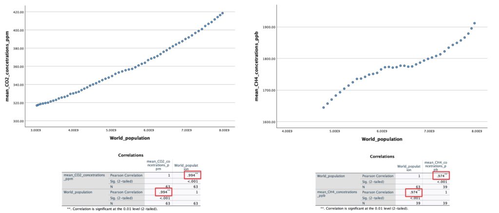
As anticipated, the correlation coefficients were notably high for both CO2 and CH4. However, this information alone doesn’t provide a comprehensive understanding. To truly grasp the magnitude of the impact that an increasing human population has on the planet, consider the multitude of preceding graphs and forecasting statistics. All these analyses were built upon the premise of a growing population, and notably, none of the prior predictive models yielded positive results—positive, in this context, meaning outcomes in our favour. Instead, they all hinted unfavourable trajectories: escalating water consumption levels tied to rising temperatures, nearly cubic growth in CO2 levels, increasing methane concentrations, a climate on track to reach Jurassic-era conditions within a mere century and a half, melting polar ice caps, reduced planetary reflectivity leading to heightened oceanic temperatures, and the degradation of vulnerable ecosystems and biomes. The list goes on. The evidence is clear, and to deny it would be a reflection of our inherent human trait—hypocrisy.
Acknowledgment
While it may seem as though we’re headed for the worst, don’t lose hope. Everything is achievable through technology and education. The goal of this study was to inform you of the exaggerated and pessimistic future ahead of us. In reality, there exists countless of initiatives and movements already in place to reduce carbon and methane emission. In fact, we have some of the biggest companies making efforts to reduce their carbon foot print. Our future generations are far from safe, however. We must keep working together to find solutions and alternatives for the future of mankind.
We would like to thank Professor Ashkan Zahedi Khomeyrani from Vanier College in Montreal. He mentioned the unreliability of longterm forecasting models and how inaccurate they can be. Additionally, he advised against a planetary study, instead he suggested studying localized data. Thanks to his observations, we mentioned after every forecasting model the inconsistency of every prediction, and we made sure to prioritize localized data comparisons, such as when we analyzed Arctic ice extent with Northern oceanic temperatures.
Similarly, we would also like to thank professor Ivan T. Ivanov for his suggestions, notably his recommendation to incorporate time series analysis into our work.
Likewise, we would like to Thank NASA, NOAA, and partners for providing open sourced climate and oceanic data thereby allowing us to complete this study. In the future, we will make sure to expand this website to compare our predictions with reality.
And lastly, I would like to personally thank Neil deGrasse Tyson for his contributions to climate change awareness, particularly through platforms like StarTalk. This whole study, specially the “planetary perspectives” sections, were inspired by his book: Starry Messenger: Cosmic Perspectives on Civilization. Just like his book utilizes an outside perspectives to analyze society as a whole, our study uses a planetary perspective to analyze the effects felt globally by climate change. Thank you.
References
B.R.I.T made use of the following resources.
[1] Elkay EzH2O water dispenser.
https://www.elkay.com/us/en.html
[2] NASA’s “Global Climate Change, Vital signs of the Planet” site owner, Biferno Anya. Edited by Shaftel Holly, Callery Susan, Jackson Randal, Bailey Daniel. Site produced by NASA’s jet propulsion laboratory | California institute of Technology. 08/11/2023.
[3] National oceanic and Atmospheric Administration NOAA, Global Monitoring laboratory GML.
[4] IBM’s SPSS software, a platform for advanced statistical analysis.
[5] NASA website, Carbon Dioxide.
https://climate.nasa.gov/vital-signs/carbon-
[6] Weather and climate of the Jurassic era.
[7] Glikson, Andrew. The rise and fall of oxygen. Published December 10, 2013.
[8] NASA website, Methane.
[9] Coal’s Importance to the World, Society for Mining, Metallurgy & Exploration, SME.
[10] NASA on, What is Climate Change?
www.Nasa//What is climate change
[11] Von Neumann’s and Enrico Fermi elephant reference.
[12] NOAA on Climate Change: Global Sea Levels.
[13] National Geographic, encyclopedic entry on ‘Permafrost’.
https://education.nationalgeographic.org/
[14] NOAA, How much of the ocean has been explored?
https://oceanexplorer.noaa.gov/
[15] MarineBio, Did you know…? Marine Life / Ocean Facts…
[16] NASA, on Ocean Warming.
[17] NOAA, on How much water is in the ocean?
https://oceanservice.noaa.gov/
[18] Harvard School of Public Health, on Water.
Understanding time series analysis. IBM Technology – YouTube.
What is a time series analysis?
Nasa, 2012-01-30, Earth, Picture taken by Visible/Infrared Imager Radiometer Suite (VIIRS).